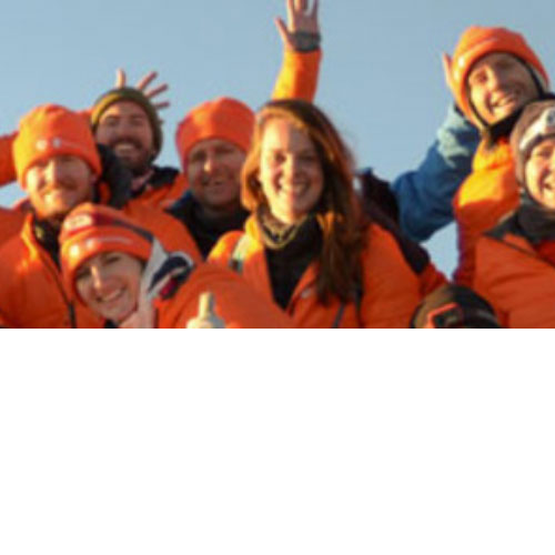
Work
I have worked on a good few projects over the past few years. Here's a selection of the most recent sites that I designed and built, and other types of design work that I am proud of.

I have worked on a good few projects over the past few years. Here's a selection of the most recent sites that I designed and built, and other types of design work that I am proud of.
There is a close relationship between UI and UX, and I have produced wireframes, user journeys and prototypes for some projects.
 Interactive wireframe protoypes
I created an interactive prototype in Adobe XD for our Sales team to use to demo the user journey of the fundraising landing page and event registration package. The idea was that the Sales team would be able to make simple branding-specific design customisations such as swapping put the logo image, relevant text and some colours. Buttons are clickable to show how users would navigate around the site, and it also includes screenshots of the two registration processes that Blackbaud and JustGiving offered functionally - the landing page is the same for both, and the registration flow changes depending on whether the implementation used JustGiving, or Blackbaud's everydayhero platform.
How to view the prototypes
User journeys, wireframes and conceptsContinuum EconomicsContinuum Economics is a financial markets research and reporting site which offers a plethora of current information to subscribers. I am responsible for creating images to accompany every article uploaded to the site, and those images are also used for Facebook and Twitter posts. I read the article summary to get an idea of what the article is about and what type of imagery I can use, and each image is sourced from a royalty- and licence-free image library website. The Marketing team is responsible for the Facebook and Twitter content and updates.

 Nutripharm Direct
Nutripharm Direct is an online one-stop shop for nutrition information, healthcare, supplements and personalised advice. They are currently undergoing a rebrand and website redesign, so I was asked to create a new logo for the new Nutripharm Direct brand. You can find out more about this project here.


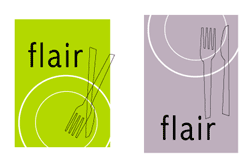
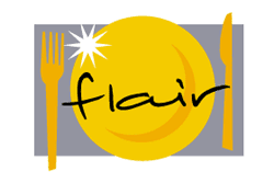
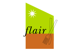
 Flair
FlairFlair was a concept where a chef cooked for you in your own home - I did these logo options for the friend-of-a-friend, and they were not used. Oh well, I had fun creating them!
 The Hillview Group
The Hillview Group is an international investment company that needed a logo identity for their launch, and then a subsequent logo identity for the group of garden centres that they invest in and manage (swipe left to see those). They have since developed the brand further, and I am glad to see that my trees still feature!
 Amazon AWS
Amazon AWS needed some simple banners to promote eBook reports that they had done for government and transport, as well a Forrester report. They needed a static and an animated version for each, with specified dimensions and the filesize needed to be no larger than 100k. For this reason, the animated ones are simple gifs.


I like to draw, and it's come in useful with creating assets for projects. Here are some things I have created, which have been used in projects.
Having worked with a CMS that allows clients to send emails, I have designed, built and tested emails. I am familiar with email design and build best practice, and my templates were built so that the clients could edit them to add in content themselves, event with little HTML knowledge. Sometimes I got to design the emails (so I would make sure that they were designed with email limitations in mind) and mostly I got the designs from the clients so I would build the HTML to be compatible with both the Blackbaud NetCommunity platform, and email clients.
The screenshots below are long scrolling images, so click to see the whole image.
Being a digital designer, print is not something that comes my way very often - it was part of my Graphic Design course and I have worked on enough print to be dangerous.
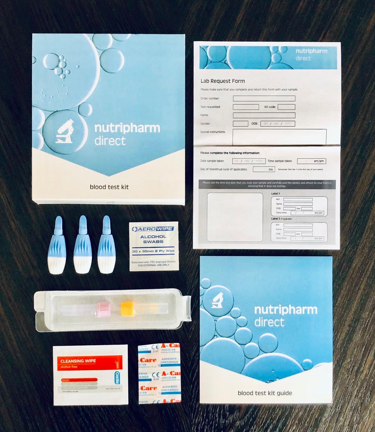
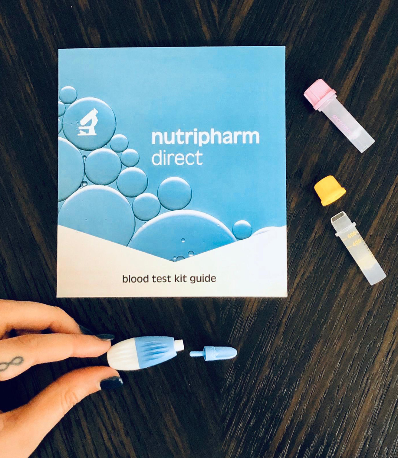
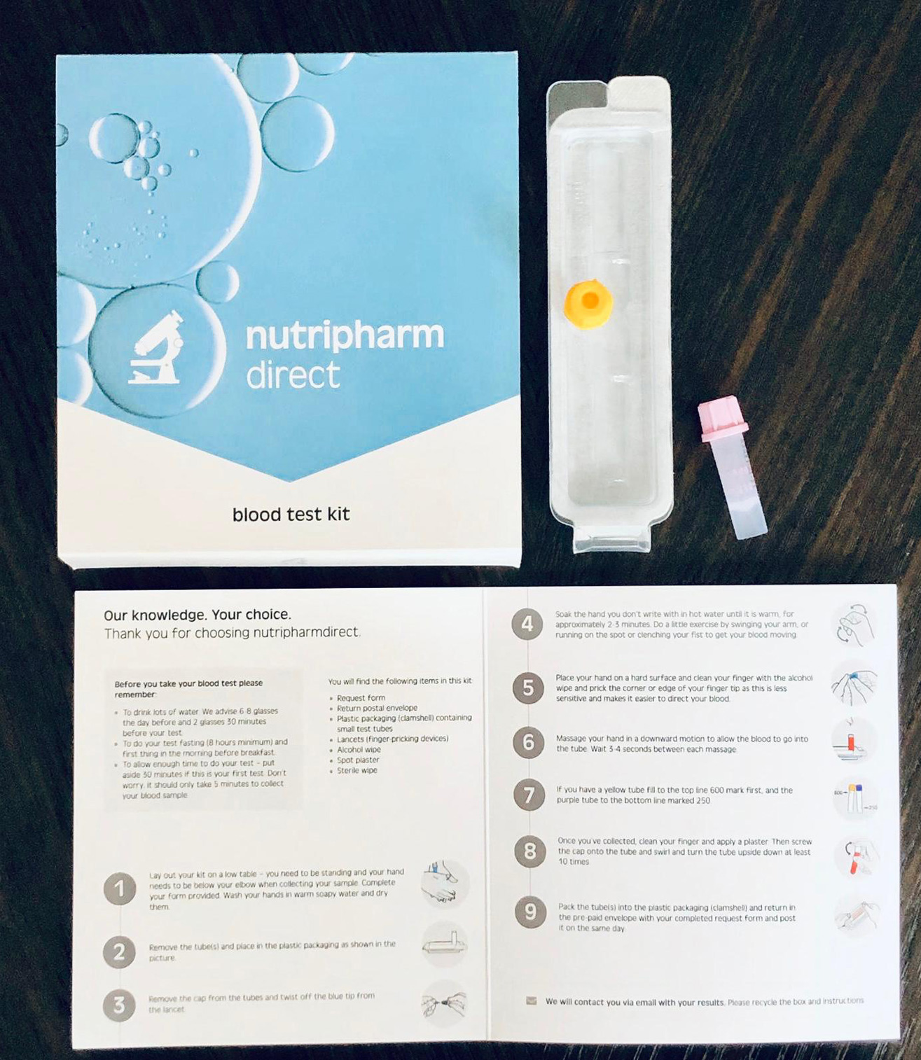
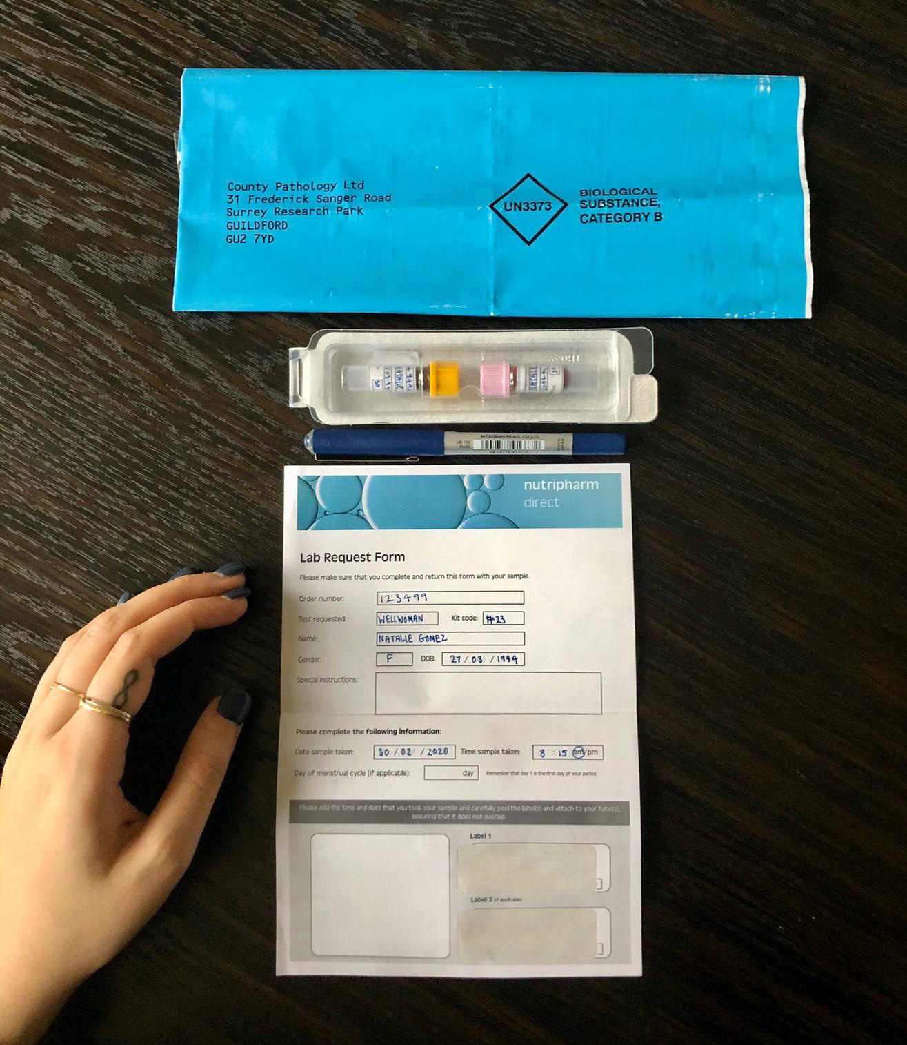
Nutripharm Direct home blood test kitNutripharm Direct is a company that aims to help people live their best healthiest life with supplements, health and nutrition information, as well as one-to-one consulting and advice. They expanded into home blood test kits and asked me to help with a design for the packaging. They had a very fast turnaround and did not have a brand or logo yet, so I could do what I liked and I decided to keep it simple until the brand was ready. I chose blue to avoid scary associations with blood (ironically) and the bubble pattern to avoid the usual clinical 'lab-coat' stock imagery usually associated with the medical profession. The task includes a lab form and an information leaflet. You can find out more about this project here.
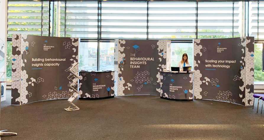
 BX Conference collateral
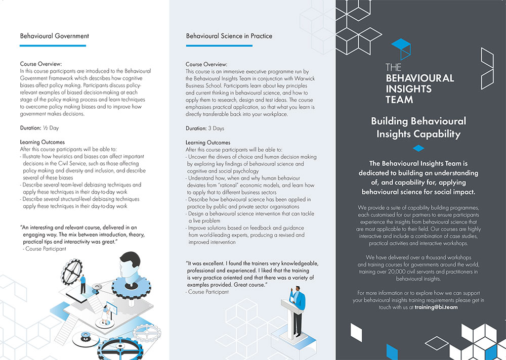
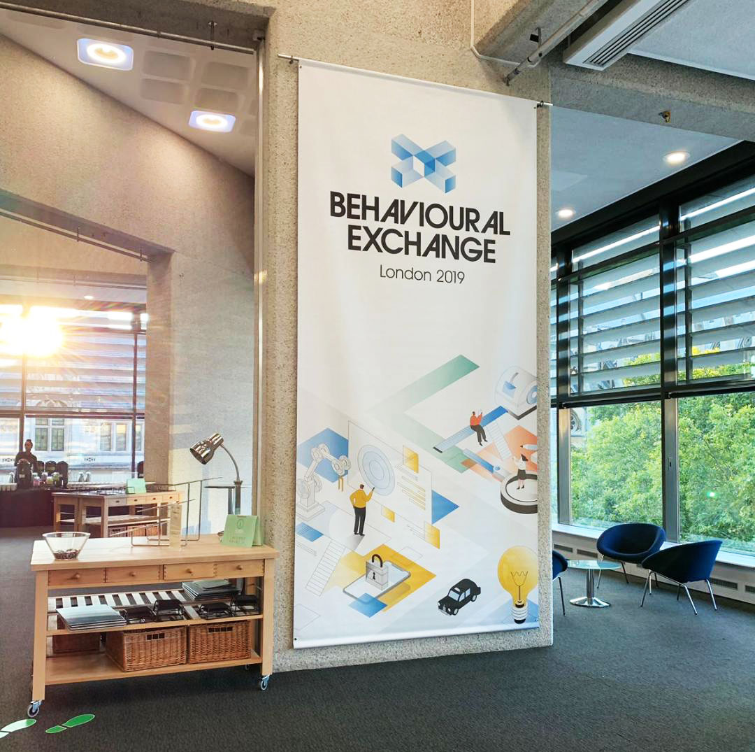
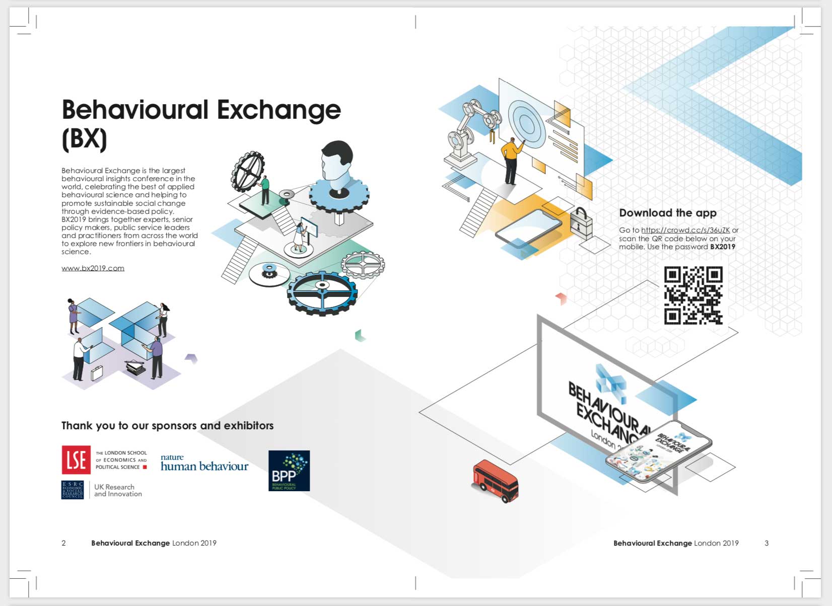
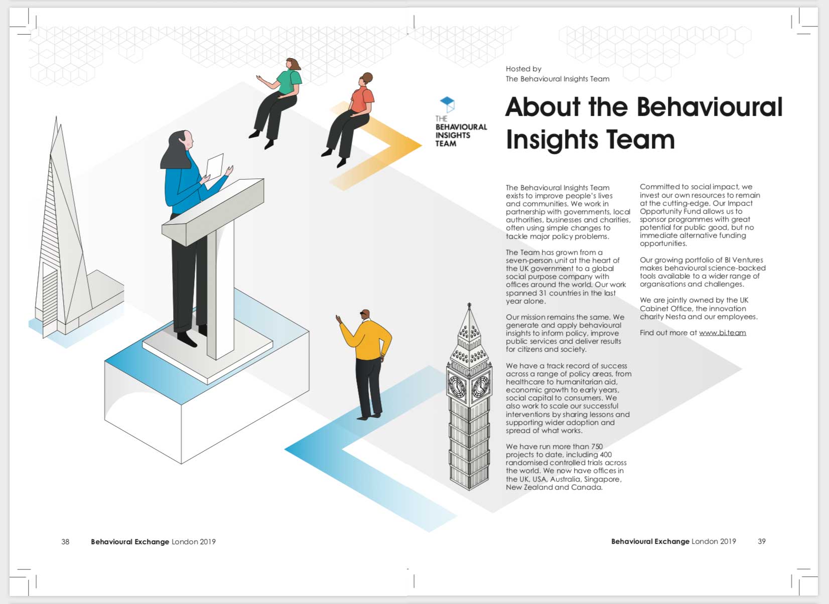
The BX Conference was held by The Behavioural Insights Group in September 2019. As part of a freelance role, I helped to product print items for the BX Conference - the main design look-and-feel, illustrations and documents had already been finalised so I was working with existing material to create new pieces, while making changes to existing documents and sticking to the printer's guidelines and deadlines.
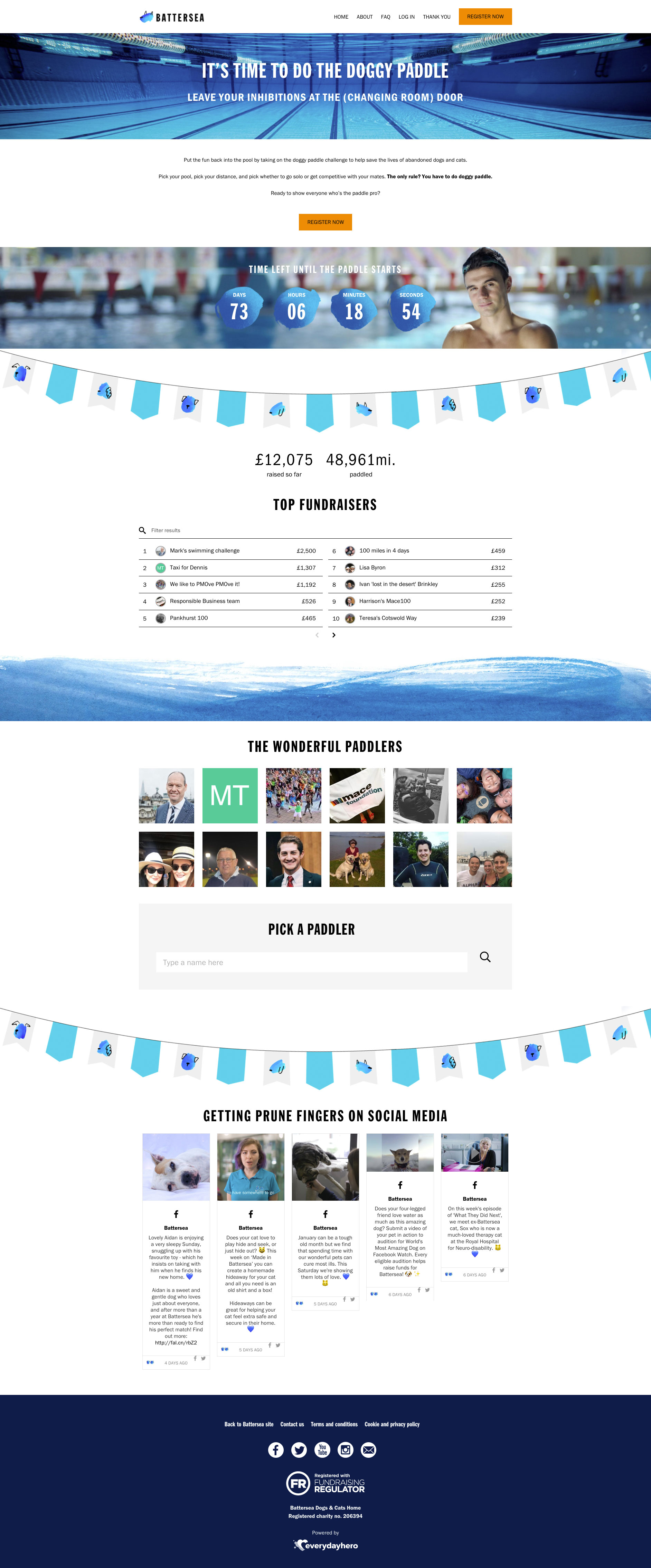
Battersea wanted to hold a virtual swimming event as part of their fundraising plan for 2019. They asked supporters to swim a distance of 1, 5, 9 or 13 miles in their own time, at a pool convenient to them, during the month of April 2019.
The site is no longer live so please have a look at the screenshots below.
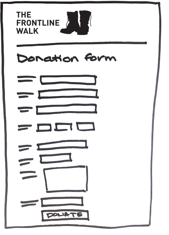
We designed and built a landing page, FAQ page, thank you page which would be seen by those who had made a donation, a registration form, and the everydayhero platform functionality which would allow for donations, track participation, and create a page for each swimmer to use to gather donations, update their supporters on their progress and track their miles. The microsite pages were built using Blackbaud's custom web CMS, which uses everydayhero APIs.
I can see the end product looking brilliant! we’re really liking how it’s coming along. Great – very happy with that!Dan, Battersea

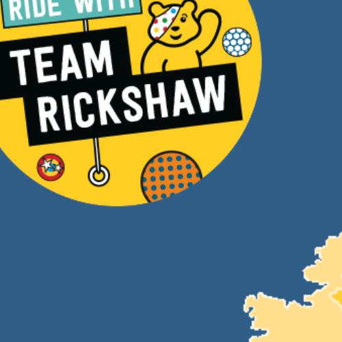
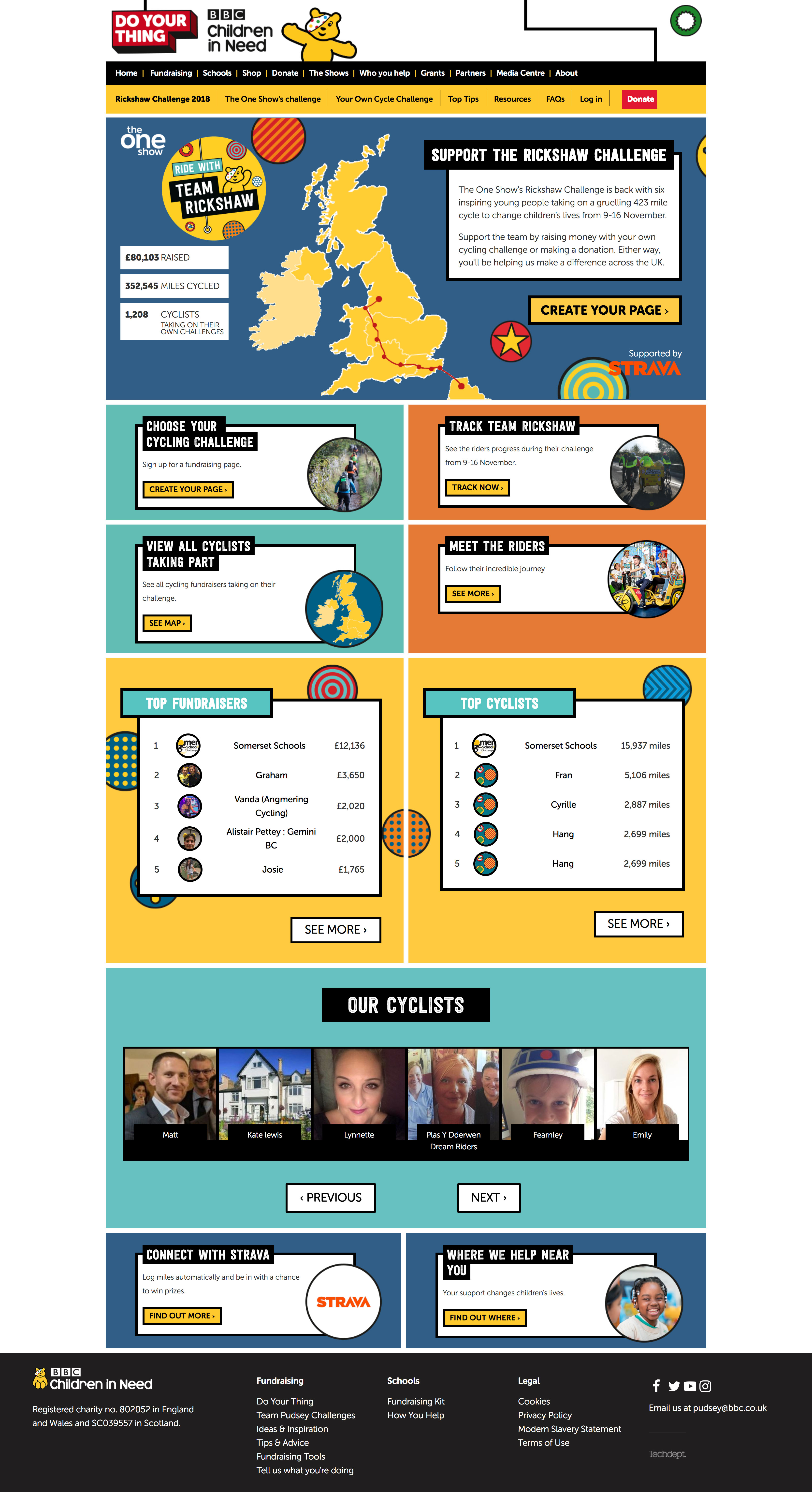
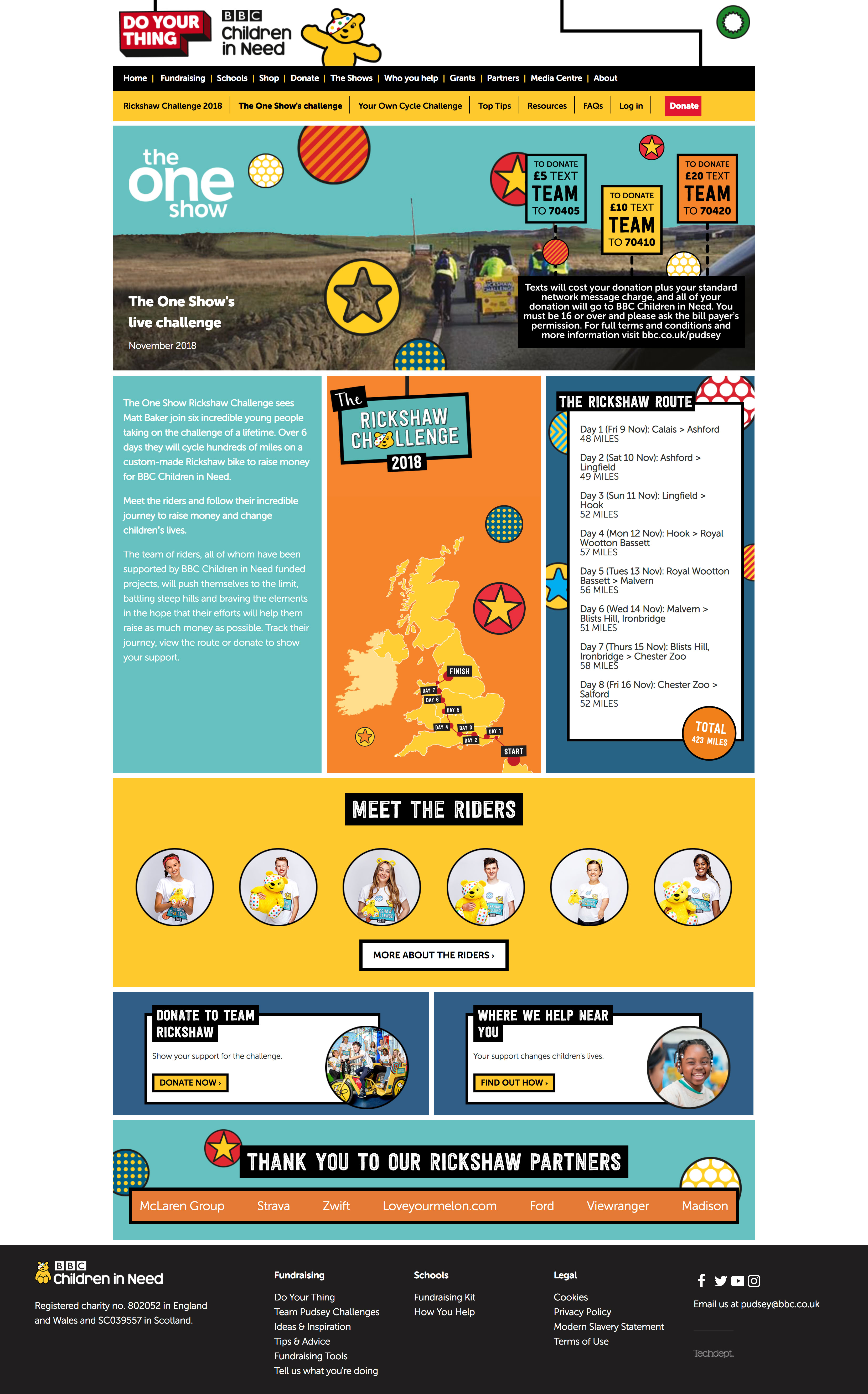
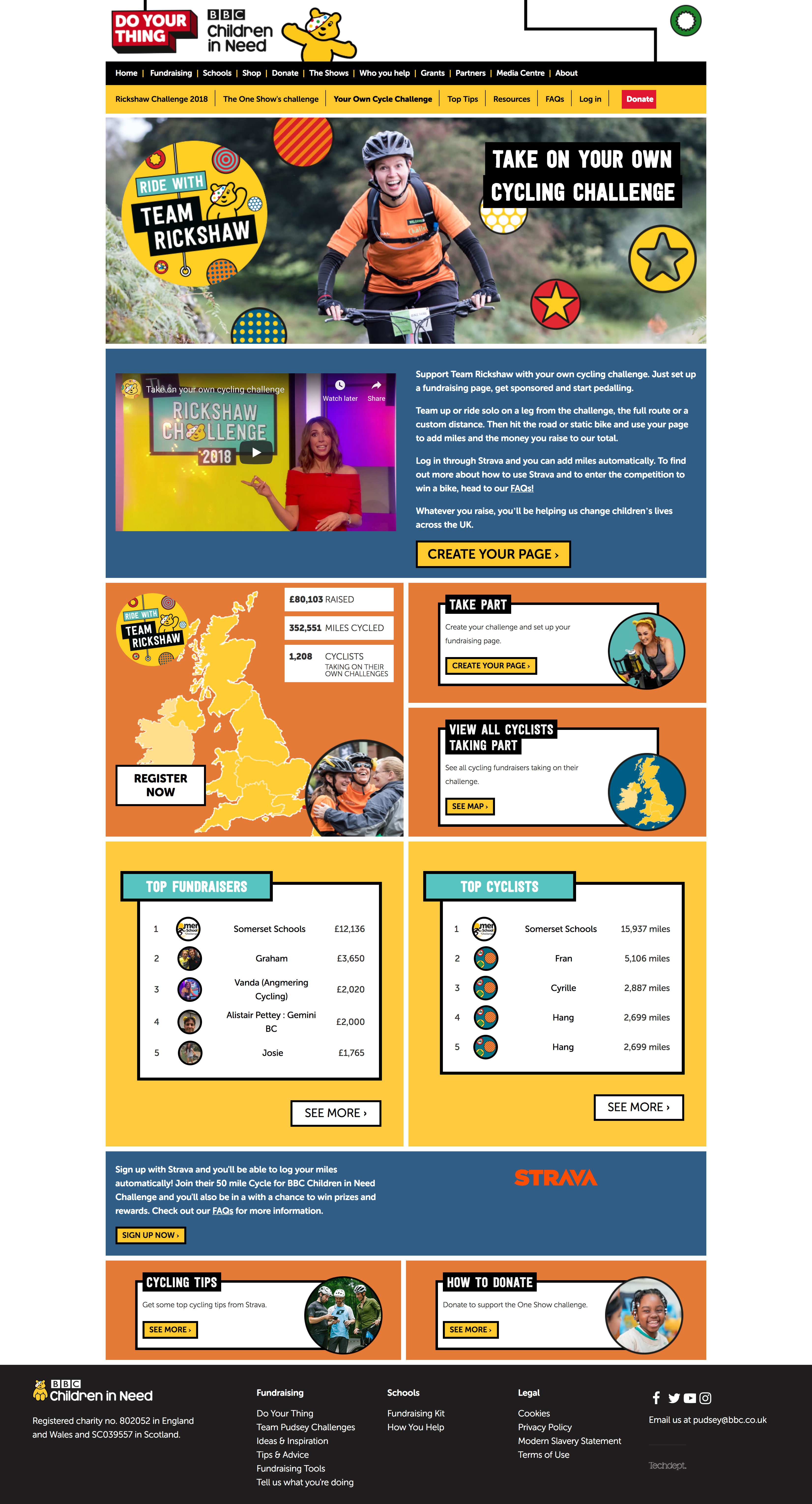
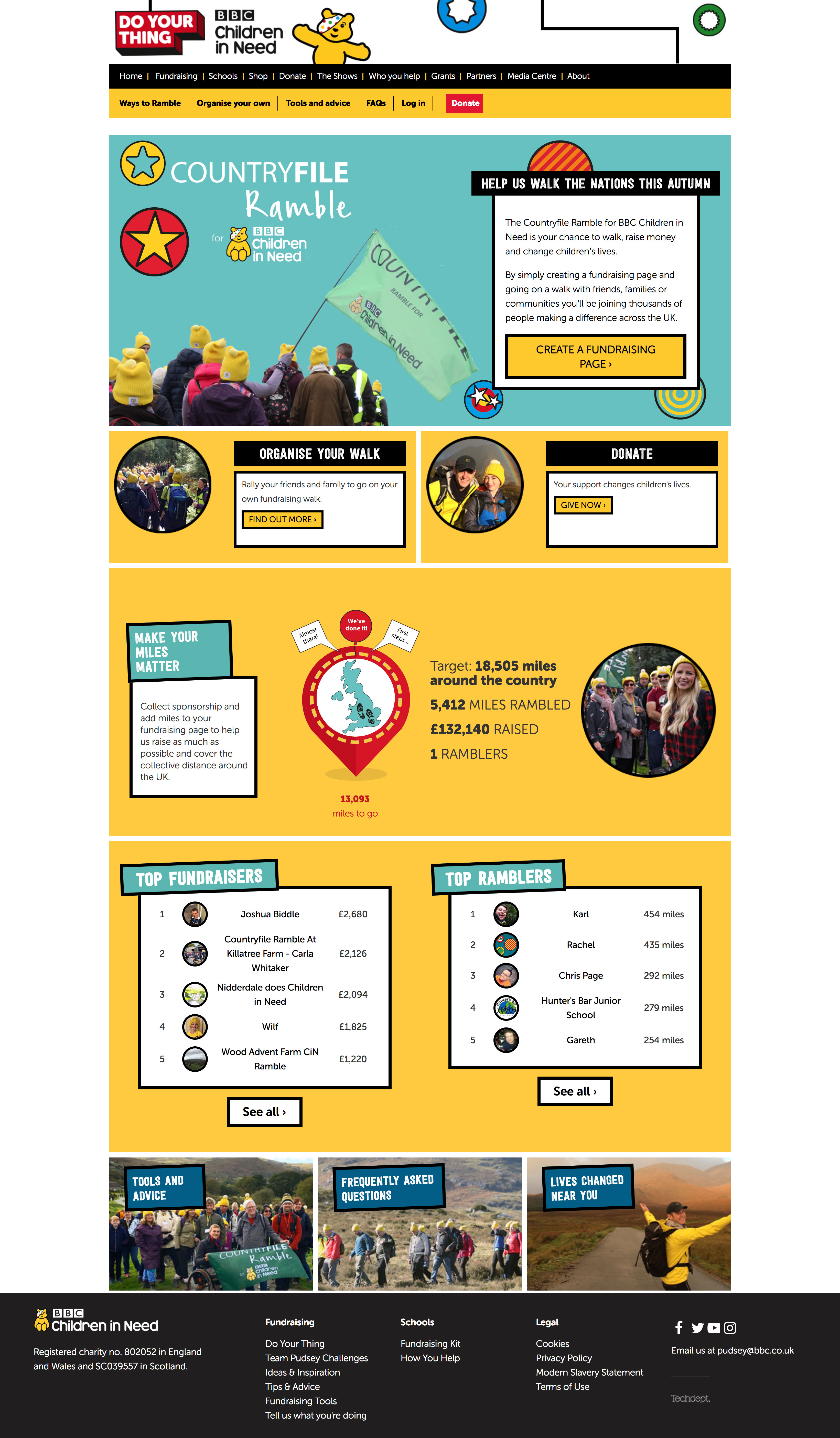
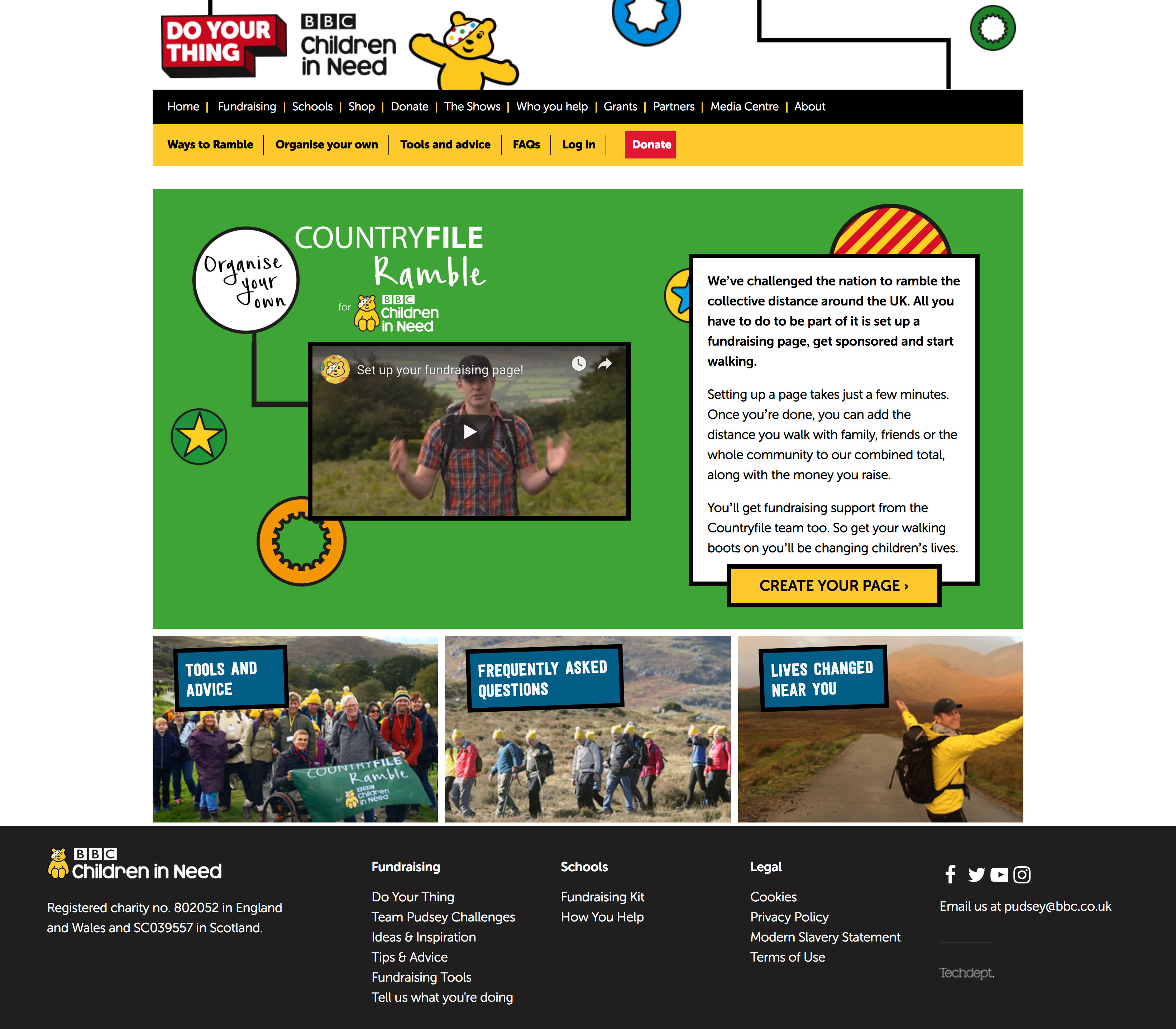
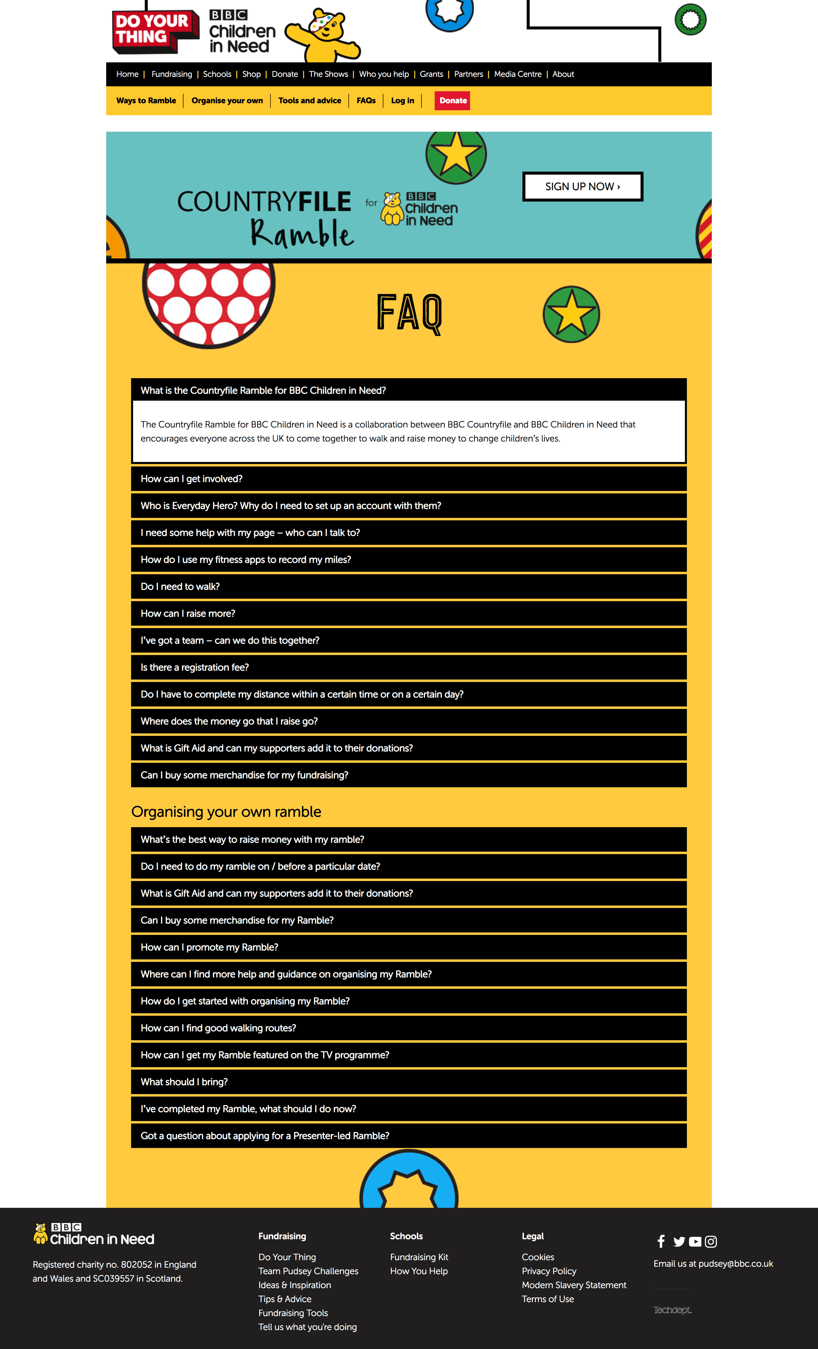
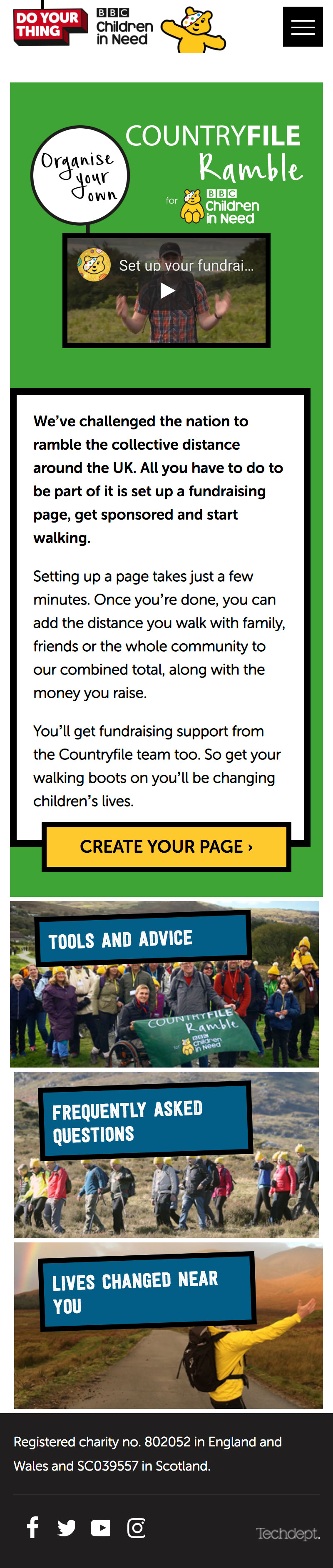
This project consists of two parts - the microsite and registration for The One Show's Rickshaw Challenge, and for Countryfile's Ramble. Both microsites facilitate members of the public being able to join in with their own rambles and cycle rides, while raising money for BBC Children in Need.
The sites are no longer live, so please have a look at the screenshots below.
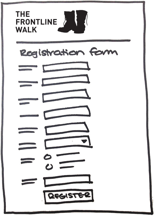
We built the landing pages with custom widgets to show progress and leaderboards, internal content pages with custom Flexbox HTML, and React registration forms which feed into the everydayhero platform. This project continued over two consecutive years - the main build was done in Year 1, and Year 2's work consisted mainly of updates to the content, and to the design of the main content areas of the pages.
It’s been great working with you. Thank you for all your help over the past 4 months! You’ve all been superstars and the sites have performed brilliantly! thank you very much for this, it looks great!Geoff, BBC Children in Need


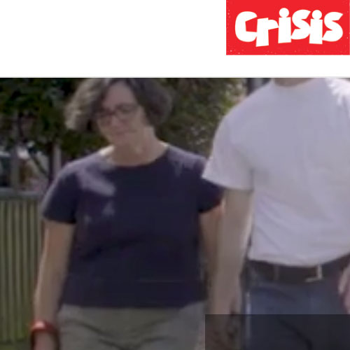
Crisis the homeless charity wanted to hold a virtual fundraising event where fundraisers were asked to cover 50 miles in 50 days, and raise £100. They could do this any way they wanted: walking the dog, running, cycling, walking, bouncing on a space hopper...
This site is no longer live, so please have a look at the screenshots below.
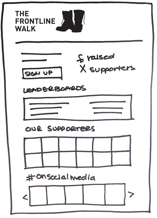
We designed a microsite based on the new, not-yet-live redesign of the main Crisis site. We built the microsite with custom HTML, the registration form, a custom thank you page, and the ability for each supporter to get their own page to collect donations and post updates. We implemented some custom widgets in the page such as totalisers, leaderboards and a supporter wall, which shows a random selection of the fundraisers (their photos, name and a button linking to their supporter page).
I love it! This is great. We liked the clear and simple layout and design.Lucy, Crisis


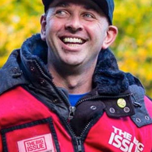
The Big Issue Foundation wanted to have a walking event that anyone could take part in, in their own time. The challenge is to walk 10,000 steps in a specified week, and raise £100.
The site is no longer live so please have a look at the screenshots below.
We had an initial chat with the team at The Big Issue Foundation to talk about what they want for the microsite and what they'd like to achieve with this fundraising event. From there, we provided a design, and once it was approved we did the site build. There are some API-driven widgets on the landing page to pull in progress, totals and fundraisers.
These look great! Generally, they’re looking really good! We really like it and we think it looks fabEllie, The Big Issue Foundation


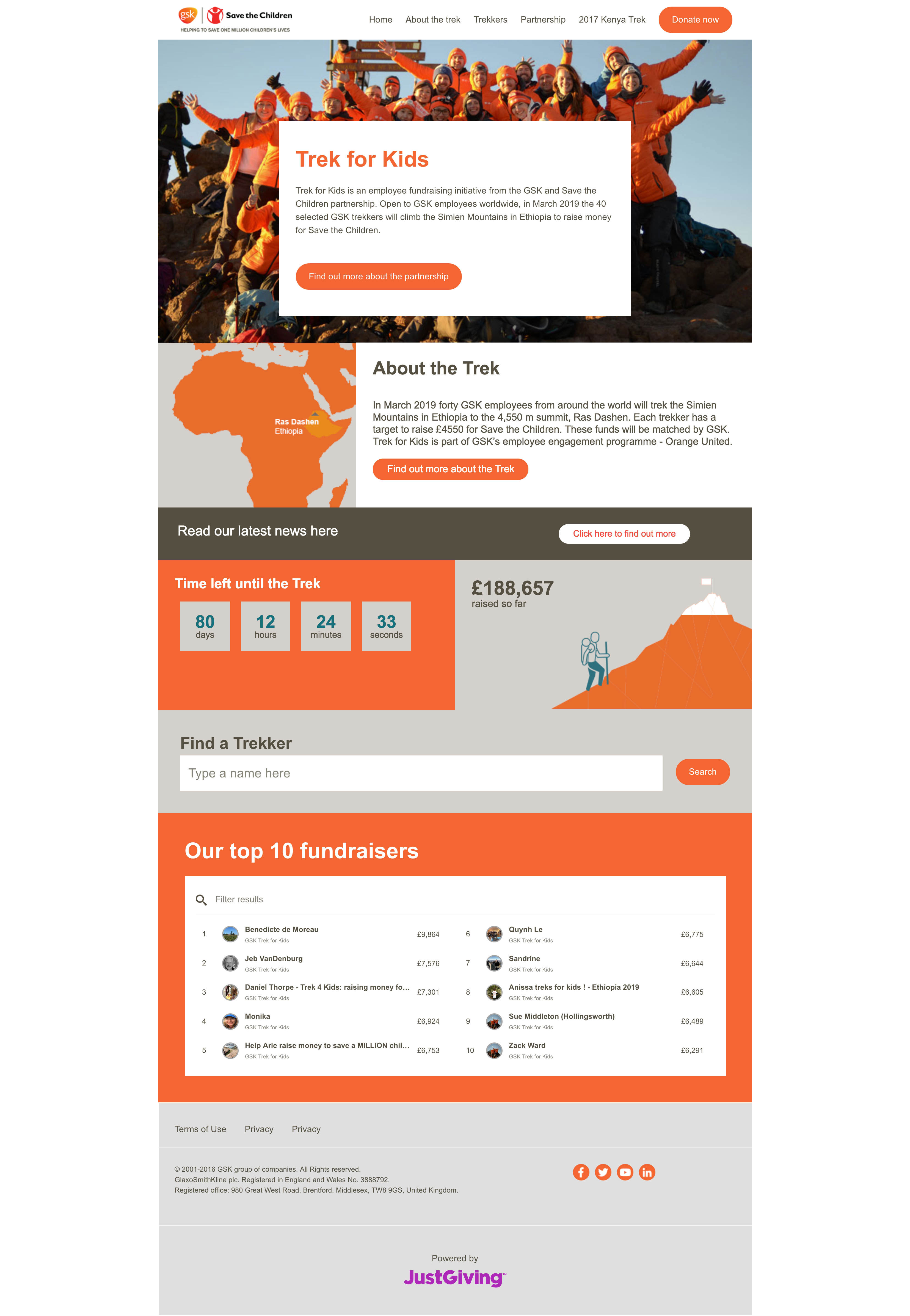
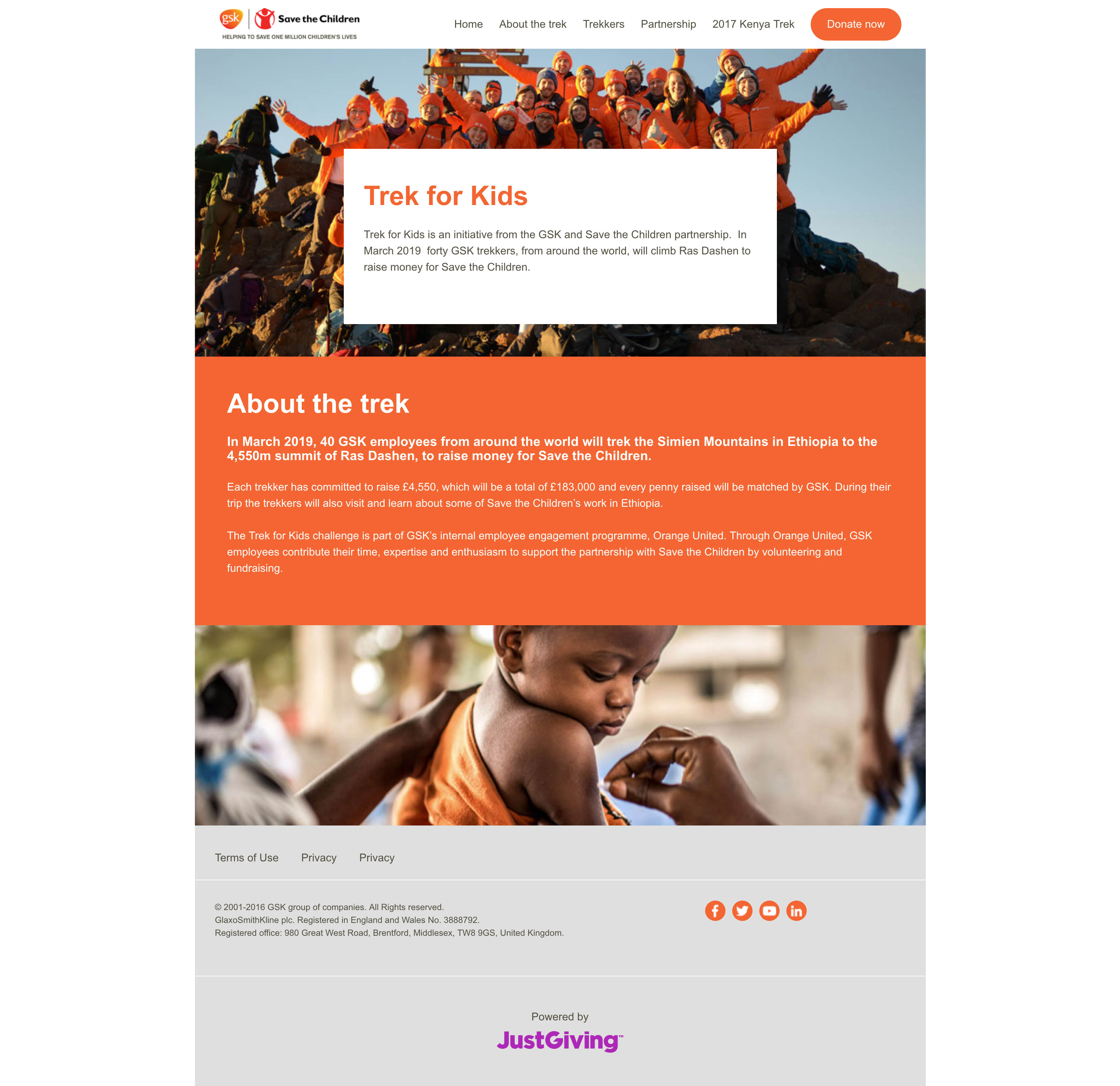
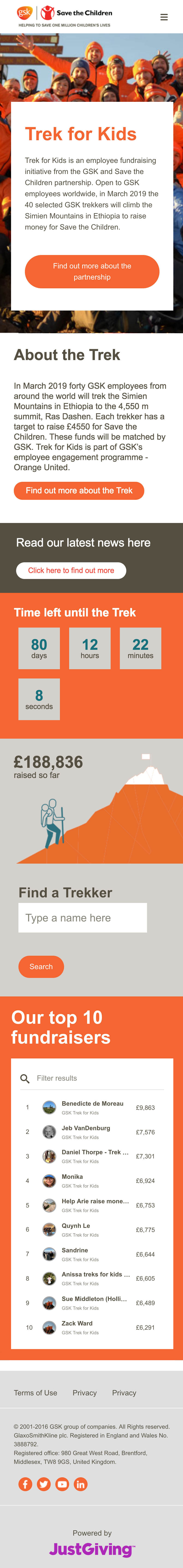
Every year, about 40 GSK employees do a fundraising challenge to raise funds for charity. In 2019, it was climbing the Simien Mountains in Ethiopia for Save the Children.
Please note that the design of the live site has changed since I worked on this project.
GSK needed a microsite which would give information about the event, the people taking part, and also provide a way for their supporters to make donations to them on their JustGiving pages. We designed the pages, collected assets and content, and built the pages using our internal API-optimised CMS.They specifically asked for certain features, such as a countdown to the climb date, a mountain-themed totaliser showing the fundraising progress, and a carousel on the landing page showing photos of the 40 participants. The participants were an internal group so there was no need for registration facilities.
This looks great Olivia, GSK
The ARCHIE Foundation is a children's hospital charity, and every year they do a virtual event with a different theme. 2017's theme was the Great Wall of China, where fundraisers would walk a 175 mile 'portion of the Great Wall', locally and in their own time during the month of September. The charity was offering prizes as fundraisers hit certain fundraising goals, which is unusual and a great perk for a charity fundraising event.
The site is no longer live so please have a look at the screenshots below.
The microsite consists of a landing page which outlines what the event is, what is being asked of the fundraiser and they also (rightfully so) wanted to highlight the prizes. Further down the page is fundraiser-driven content such as leaderboards and a social feed. Other pages feature information about the charity, the event, FAQs, and how to find a friend to donate to them. This site also includes a custom fundraiser statistics page - a custom designed and built page which is specific to the user. It shows their photo, name, progress bar of raised/still to go, and when they started the challenge. We've especially proud of the postcards - the virtual route is based on an actual 175 mile section of the Wall, with landmarks along the way. We wrote come nifty code that works out where the fundraiser would be along the way based on their walked distance, and then show a postcard on their page which has a photo of the area of the Wall, a map showing where they are on the Wall and a description of the area. The postcard shows as a photo, and flips over on hover to reveal the location message.
We all love it. Totally on the right track. Loving everything so far and don't think there will need to be too many changes!Claire, The ARCHIE Foundation


Hogan Lovells is an international law firm that wanted a site to encourage its employees to fundraise for a charity called Barefoot College, as part of their CSR initiative.
The site is no longer live, so please have a look at the screenshots below.
We worked with Hogan Lovells to design and create a landing page, a page per international office, and some extra general information pages such as FAQ. They have very strong branding and we needed to stick with that, with the design needing the approval of their internal design team before we could start the build. The microsite is built in Blackbaud's custom CMS, with some custom coded widgets that we have embedded with iframes - we have a world map showing regions and the Hogan Lovell regions on hover, and overall totals. When a region is hovered over, it shows that region's raised amounts with a link to the region's own page. The region pages show how much has been raised, how many participants there are, a fundraiser search, and a supporter wall with a tile for each fundraiser, which links to their specific JustGiving page.
They look fantastic so far.Regan, Hogan Lovells


ABF The Soldiers' Charity wanted to fundraise with a virtual event to commemorate the centenary of the First World War. A group of people were going to actually walk the Western Front so this was the opportunity for anyone wanting to fundraise to walk 100km in 42 days, with the event ending on 11 November. They also wanted to encourage participants to research their own military family history.
Please note that the live site design has changed a little since I worked on this project, so please have a look at the screenshots below.
Our microsite consisted of a landing page with some other content pages which explain the event and provide some more information about the charity. The landing page contains a lots of custom widgets: a section which cycled through some actual WW1 soldiers, and placing them next to a randomly displayed fundraiser, totals showing amounts raised, collective distance walked and total registered participants, a countdown until the event ends, leaderboard and supporter wall (pulling in a random selection of participants). Each fundraiser had their own page with which they could collect donations and update their supporters with their progress, as well as a statistics page which gave a much more custom designed and built display of their progress - this included their photo, photo, military rank given based on their raised amount (like a badge), uploaded photos from their supporter page, and a list of their donors.


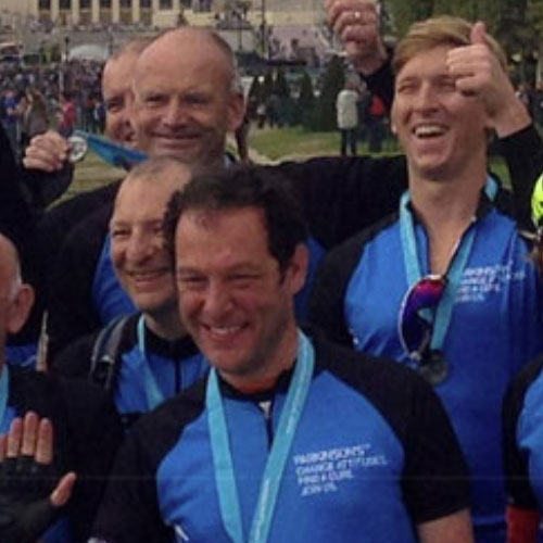
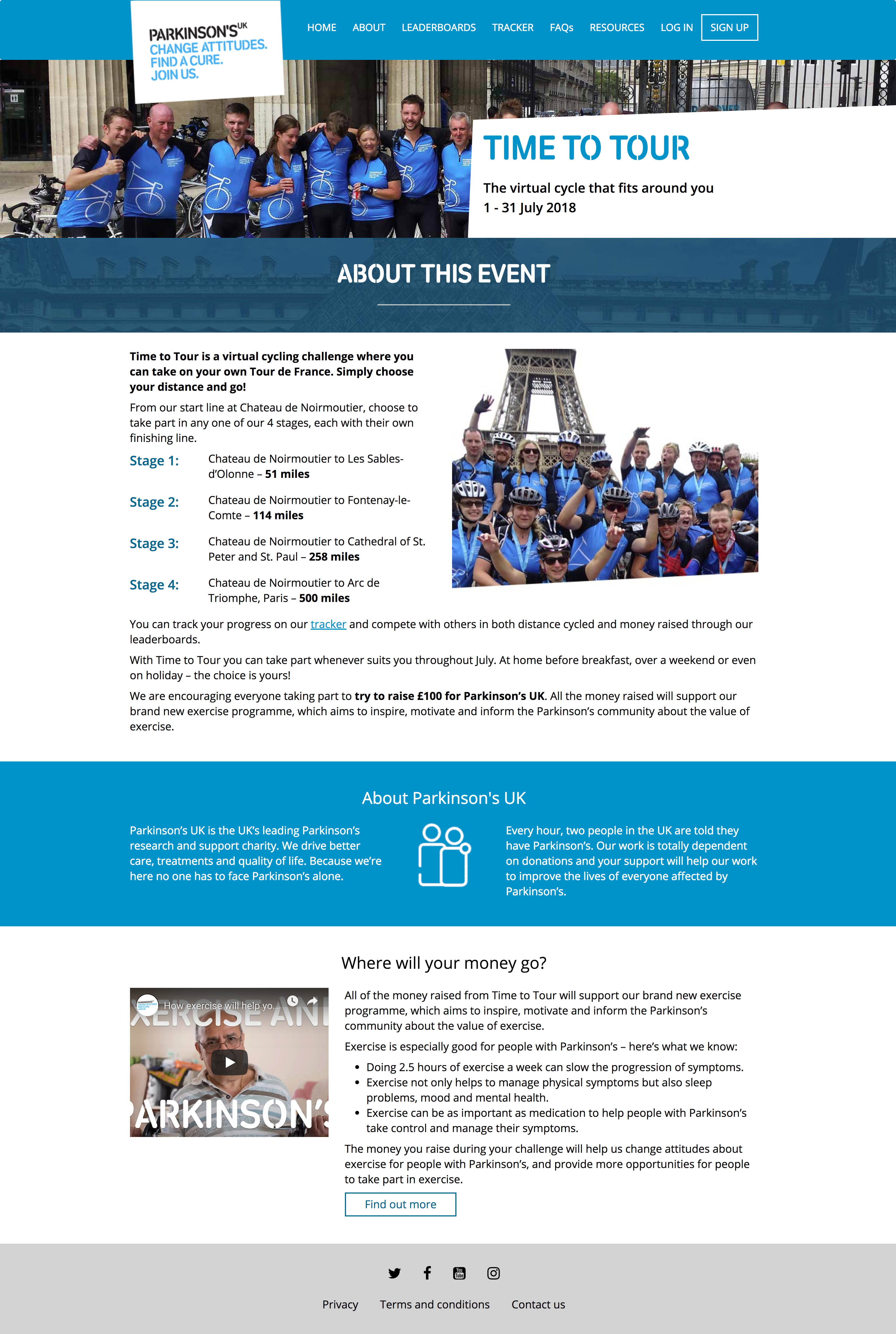
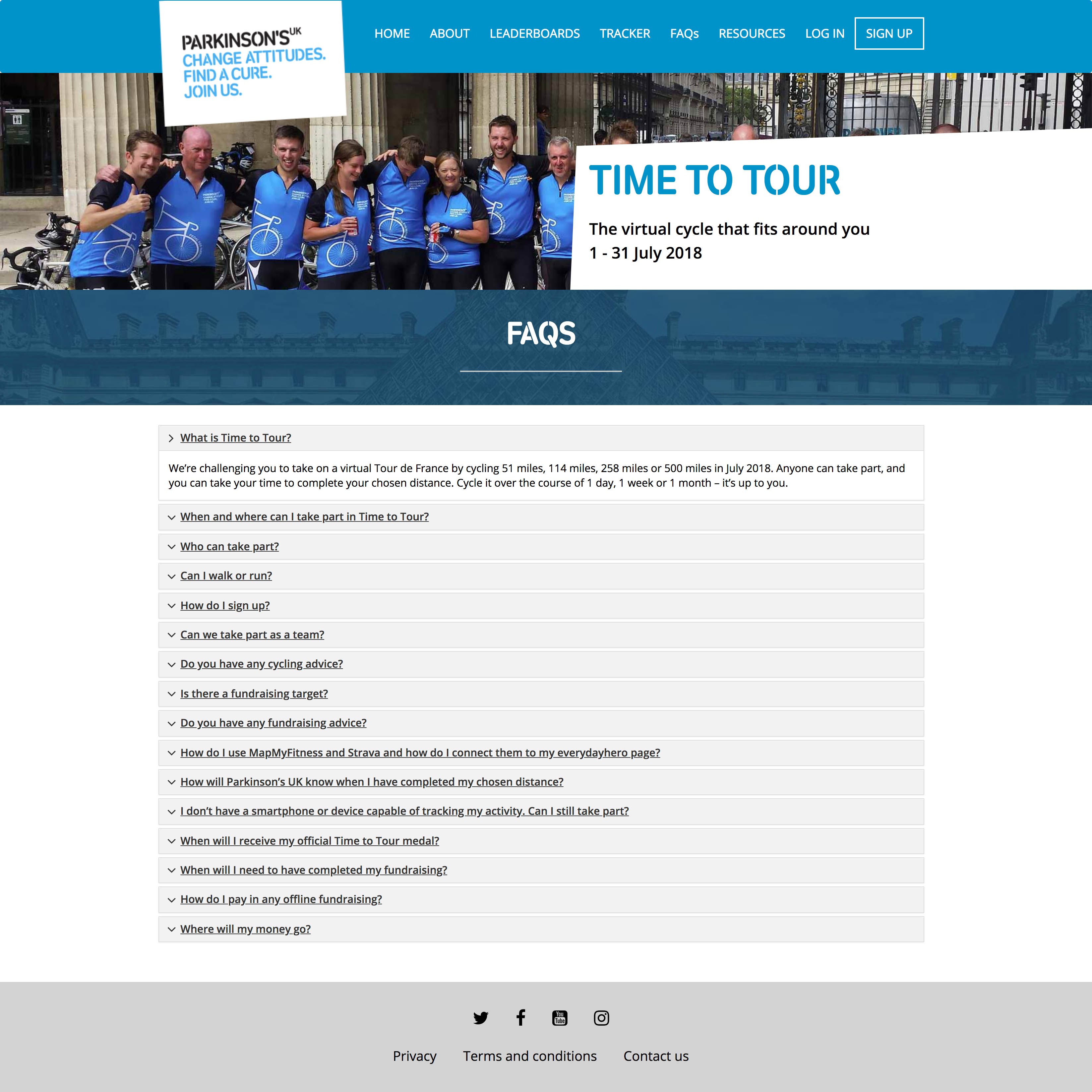
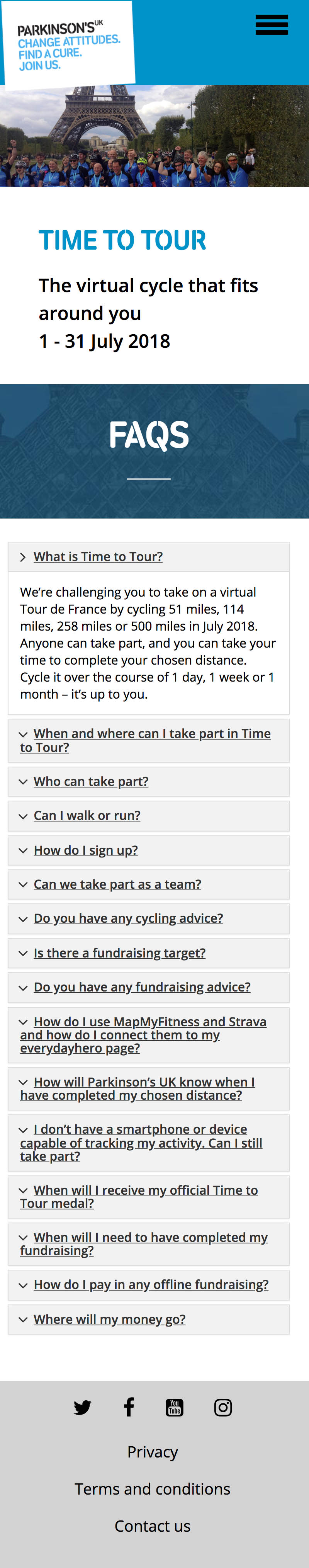
Parkinson's UK wanted to have a cycling virtual event based on the Tour de France. Fundraisers could choose a distance that suited them, based on sections of the TdF route and cycle that distance in a specified month. 'Jersey' badges were awarded for reaching distance goals.
The site is no longer live so please have a look at the screenshots below.
We created a landing page with other informational subpages, and the registration functionality. Parkinson's Uk has great branding and imagery so we used it as a base for the design and also included a strong cycling theme. As this was a competitive event to appeal to competitive people, we introduced the idea of earning your jersey by hitting the distance goals, leaderboards per distance and prominent totalisers. We also build a tracker map so that cyclists could see how they compare to other cyclists along the virtual route, and a section showing most recent donations. The landing page shows a condensed version of the leaderboards, with the full board of all participants on its own page.


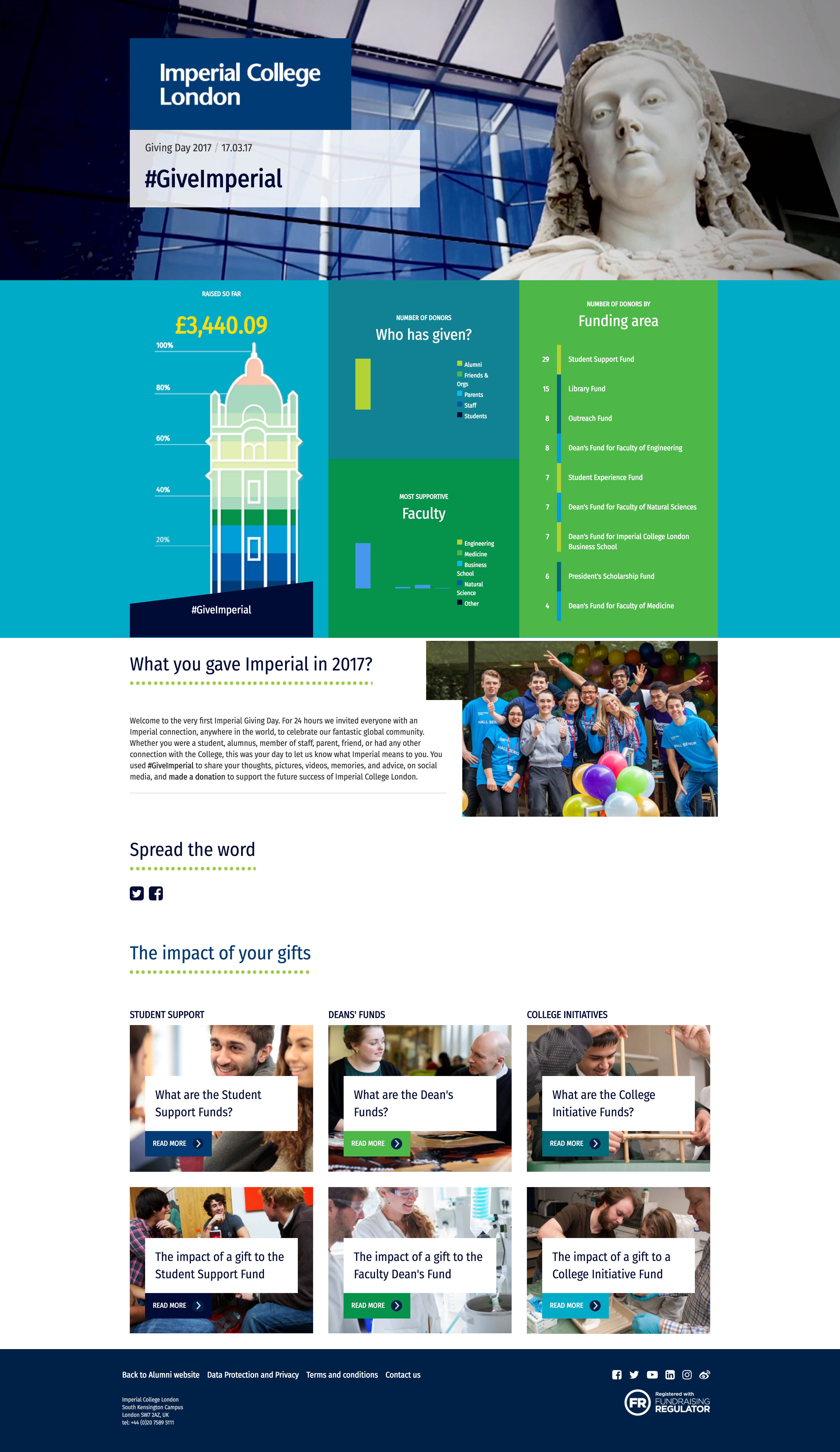
Imperial College London wanted to try out the idea of a Giving Day - a one day event at the university where students are encouraged to donate.
The site is no longer live so please have a look at the screenshots below.
The project is a one-pager to basically act as a progress indicator of how well the fundraising is going, with some information about where the money will go. We build some totalisers to show some different pieces of information - not just how much has been raised, but a breakdown of who made the donations.
Firstly just to say thank you for a great first draft, even after having passed it around a few key stakeholders, the response has been very positive with only a couple of suggestions from each person. Thanks so much Nicole, very chuffed with it.Andrew, Imperial College London

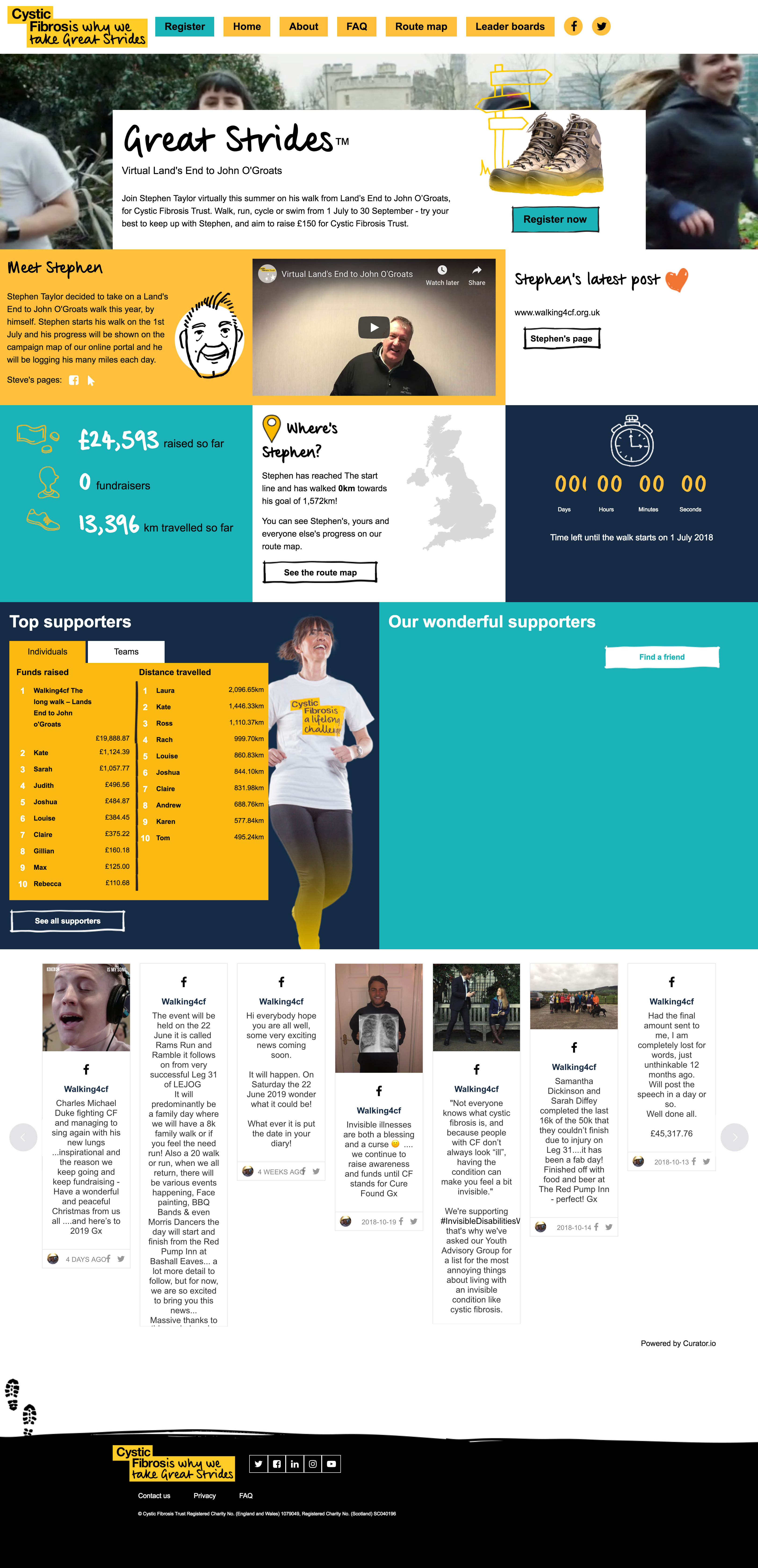
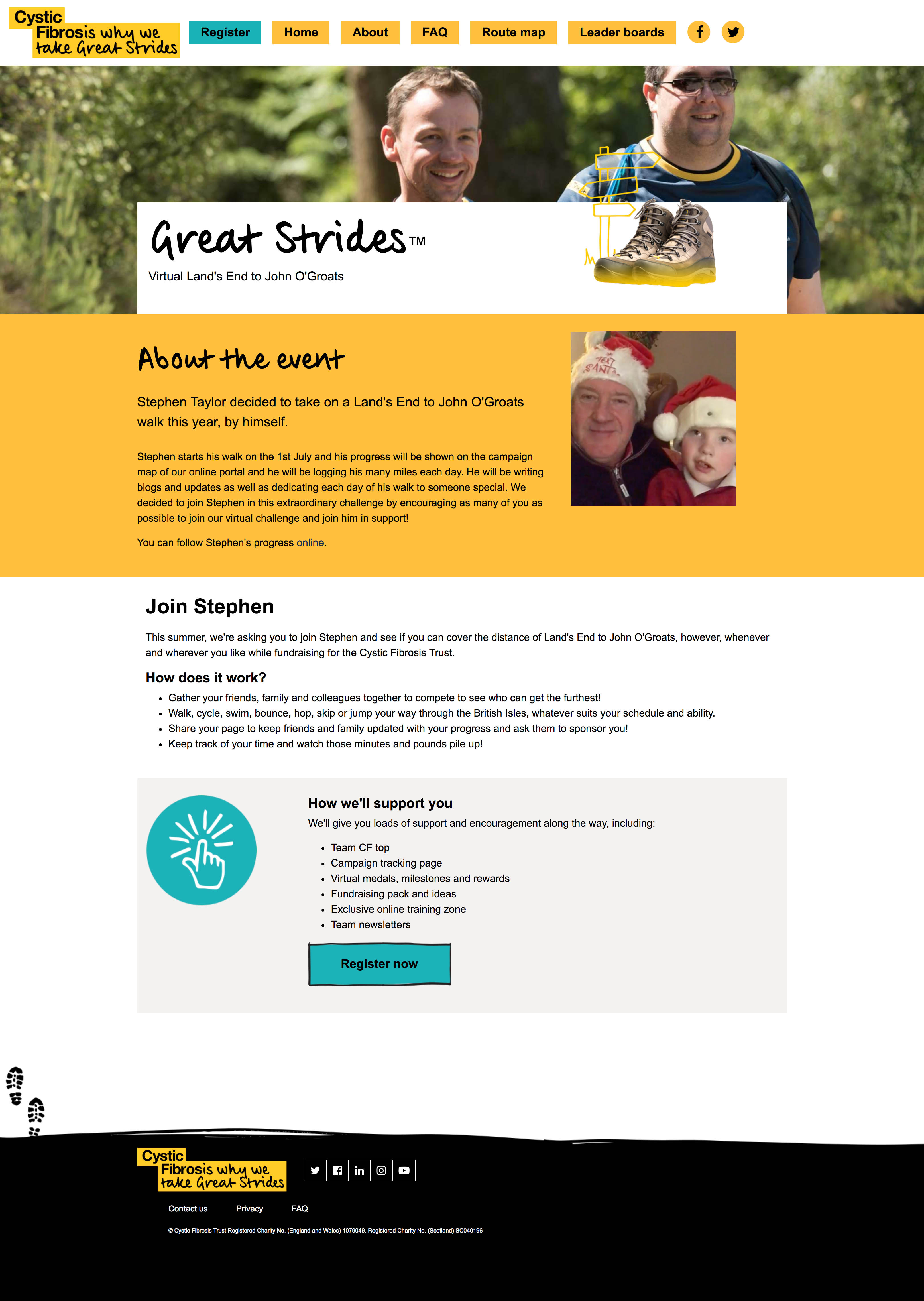
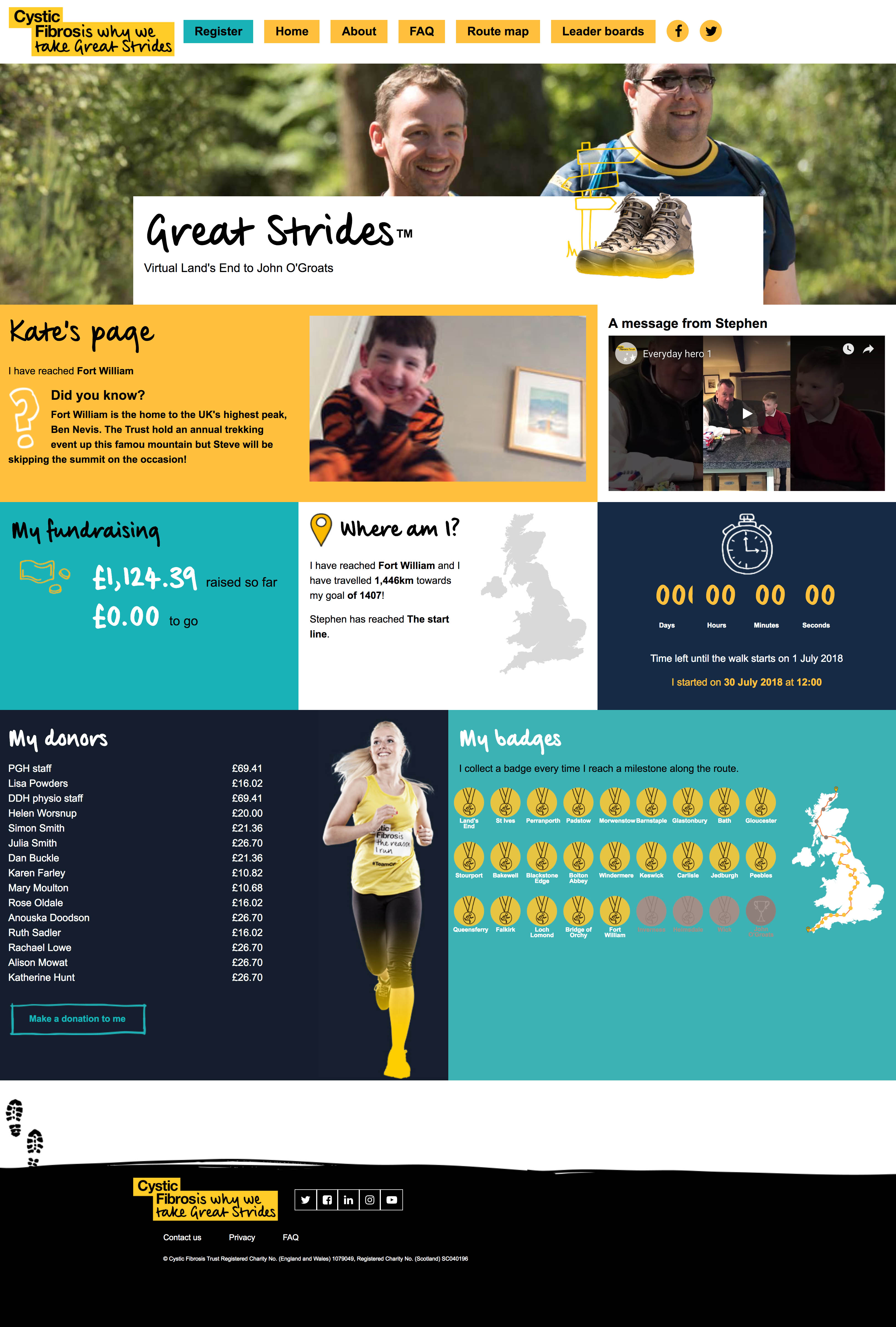
Cystic Fibrosis Trust have a super-supporter in the form of Stephen Taylor, whose grandson has cystic fibrosis. Stephen planned to walk from Land's End to John O'Groats to raise funds for Cystic Fibrosis Trust. The Great Strides site allows anyone to 'join' Stephen on his walk from 1 July to 30 September, walk the same distance on their own and raise £150 for CFT.
We built a landing page to talk about the event, and Stephen's involvement, and we also have extra subpages with some more information about the event. We added some fun stuff to the landing page to help make it feel more like the fundraisers are on a journey with Stephen - a video from Stephen about why he is doing the walk, his progress and updates from him. To encourage fundraisers to feel part of a community doing this together, we have leaderboards, totalisers of overall achievements and a wall of randomly selected users. This site also has a custom statistics page for each fundraiser - it includes their photo, call to action to donate to them, which virtual landmark along the route that they have reached, based on the distance that they have covered. Each landmark has its own fun fact and the fundraiser achieves a badge as a reward for their progress, and they have their own totaliser for finds raised. We can also see each participant's list of donors.
Wow! Firstly – we are all absolutely amazed at this. Really happy with how it’s come out Holly, Cystic Fibrosis Trust


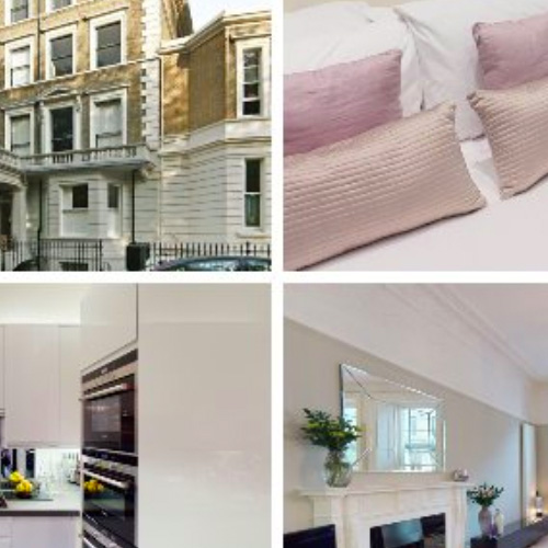
The Harrington Collection is a group of restored buildings in Kensington, London, which have been converted into luxury serviced apartments. It is Fin-Ex's main company, and it was my first project when I started as their designer. It was a large ongoing project where we redesigned the site and added new membership functionality.
When I started at Fin-Ex, the developers had already started building the site with a combination of Bootstrap and Wordpress - they had put in the basic content and page structure, and it was my job to skin the pages with a new design. My aim was to keep the structure of the design as similar as possible to the existing build, to avoid the developers having to rebuild any content or functionality while applying my design to their pages.
Continuum Economics is part of the Fin-Ex group, and I was responsible for creating images for each new article uploaded to the site each week. These images appeared with the article itself on the Continuum Economics site, as well as the Facebook and Twitter pages:
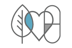
Nutripharm rebranded to Nutripharm Direct, with a website redesign. As it is one of Fin-Ex's companies, I was asked to help out with brand design work that needed to be done. They had no specific brand, so I came up with some logos with a nutritional theme and we chose one that we felt summed up Nutripharm Direct and its ethos. A developer was responsible for the design and build of the Shopify site.


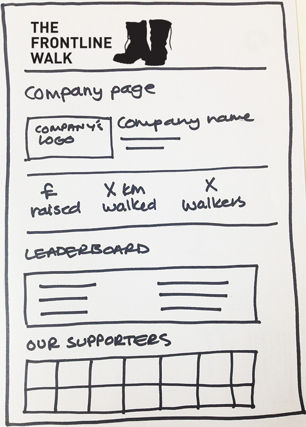
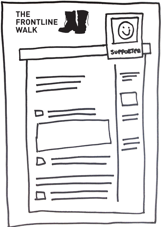
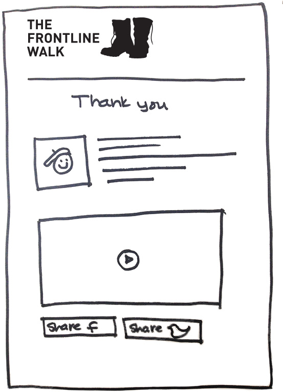
The client asked for a basic user journey demonstrating how the different pages that we were designing and building fitted into a start-to-finish registration journey. These wireframes were requested after the project had been sold and started, which is why they are simply hand-drawn, and then laid out in the correct order and saved out as a PDF.
You can find out more information about this project here.
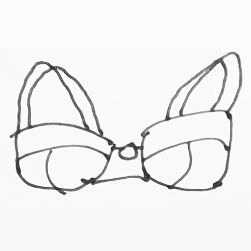
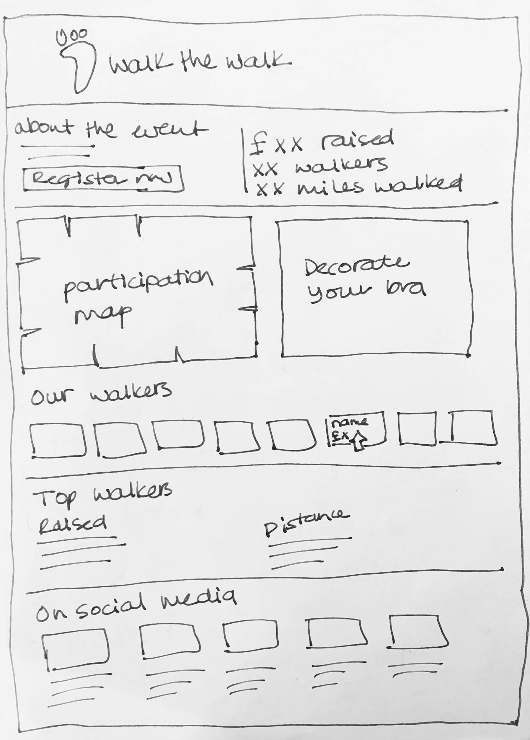
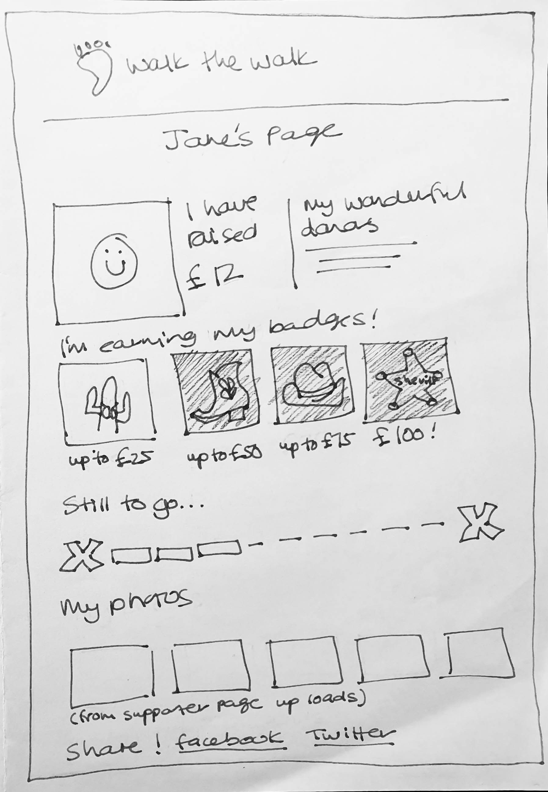
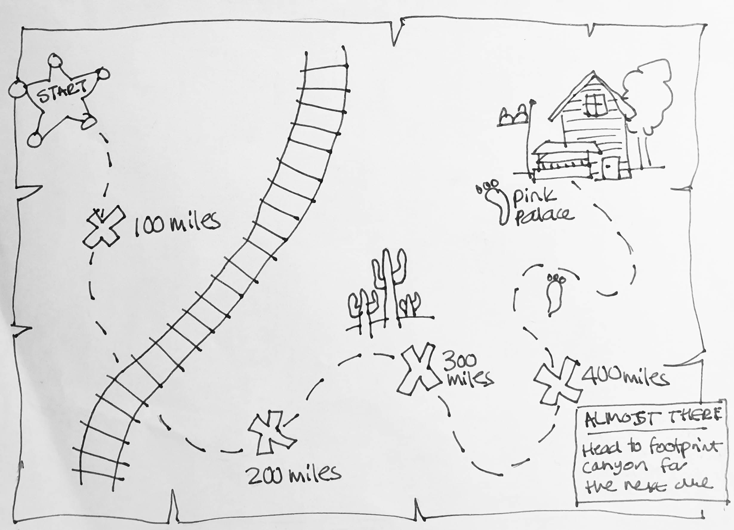
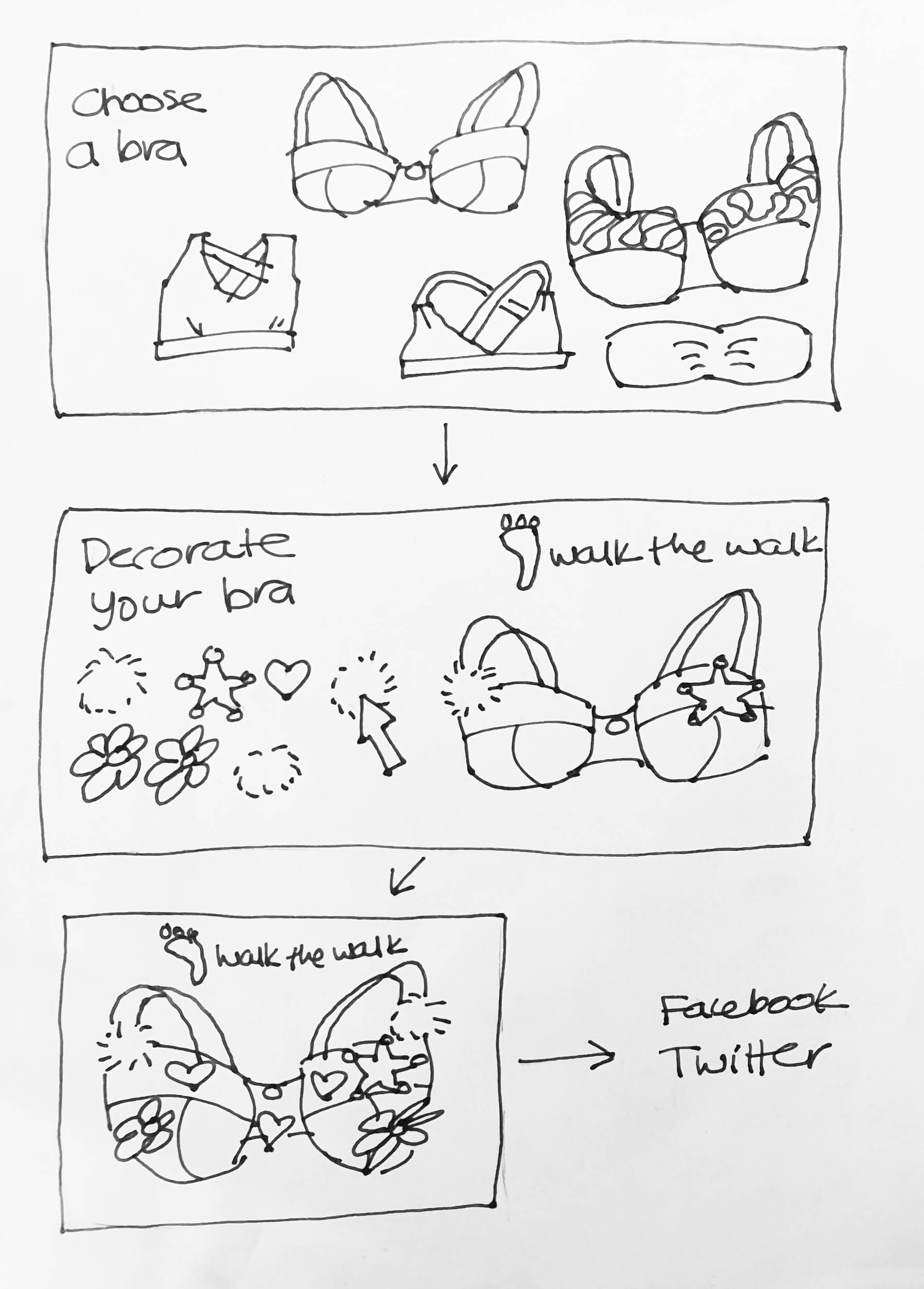
Walk the Walk is a breast cancer charity, known for their midnight walks where fundraisers are invited to walk in bras. Every year, there is a different theme for the walk, and an opportunity for walkers to customise their bra accordingly. I was asked by the Account Manager to suggest some ideas of the next theme (Wild West) could be reflected on the Walk's digital presence, so I created the wireframes and concept sketches below. The ideas were not used, but the customer was very impressed with my ideas and visualisations.
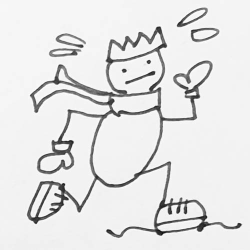
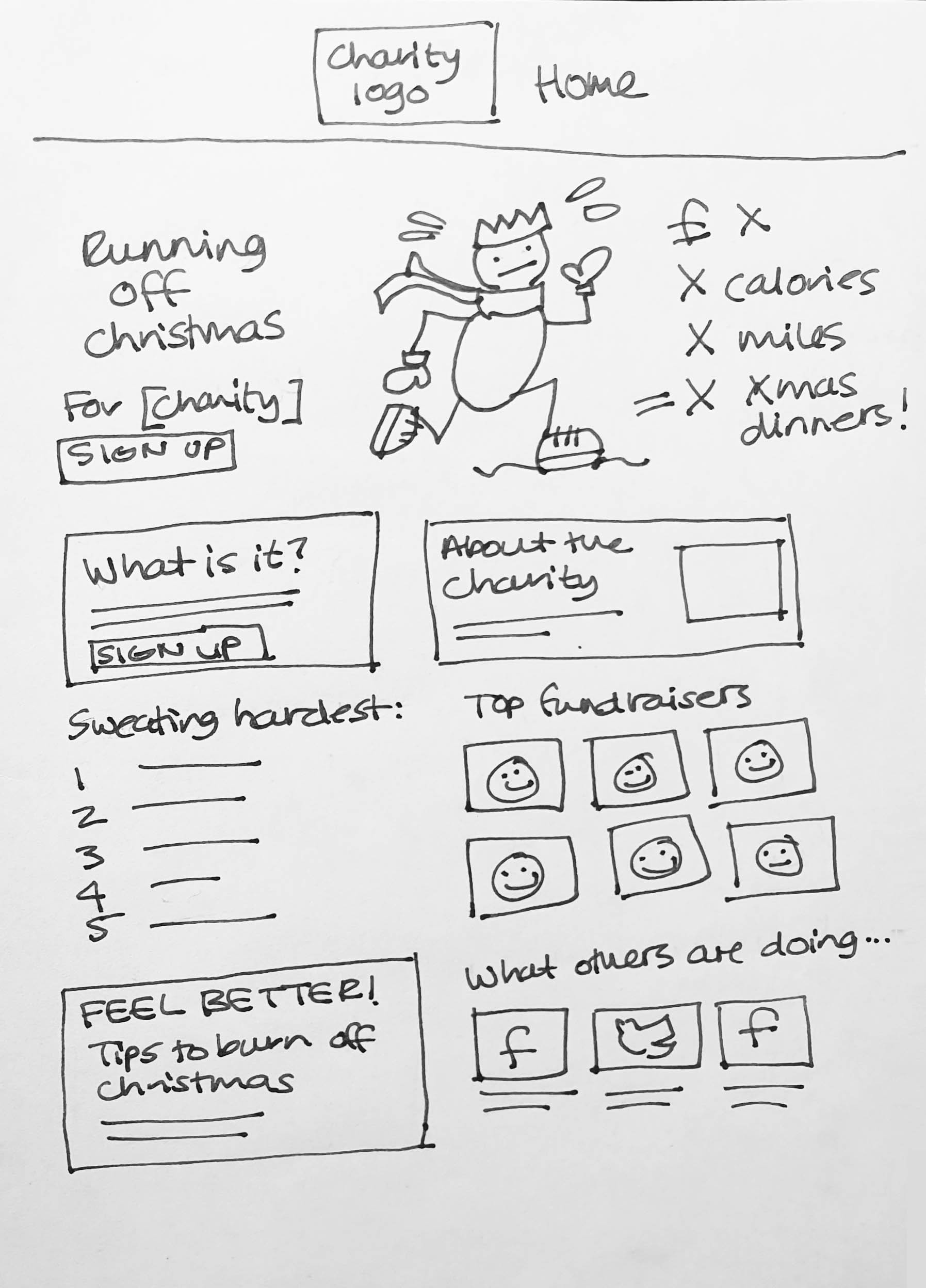
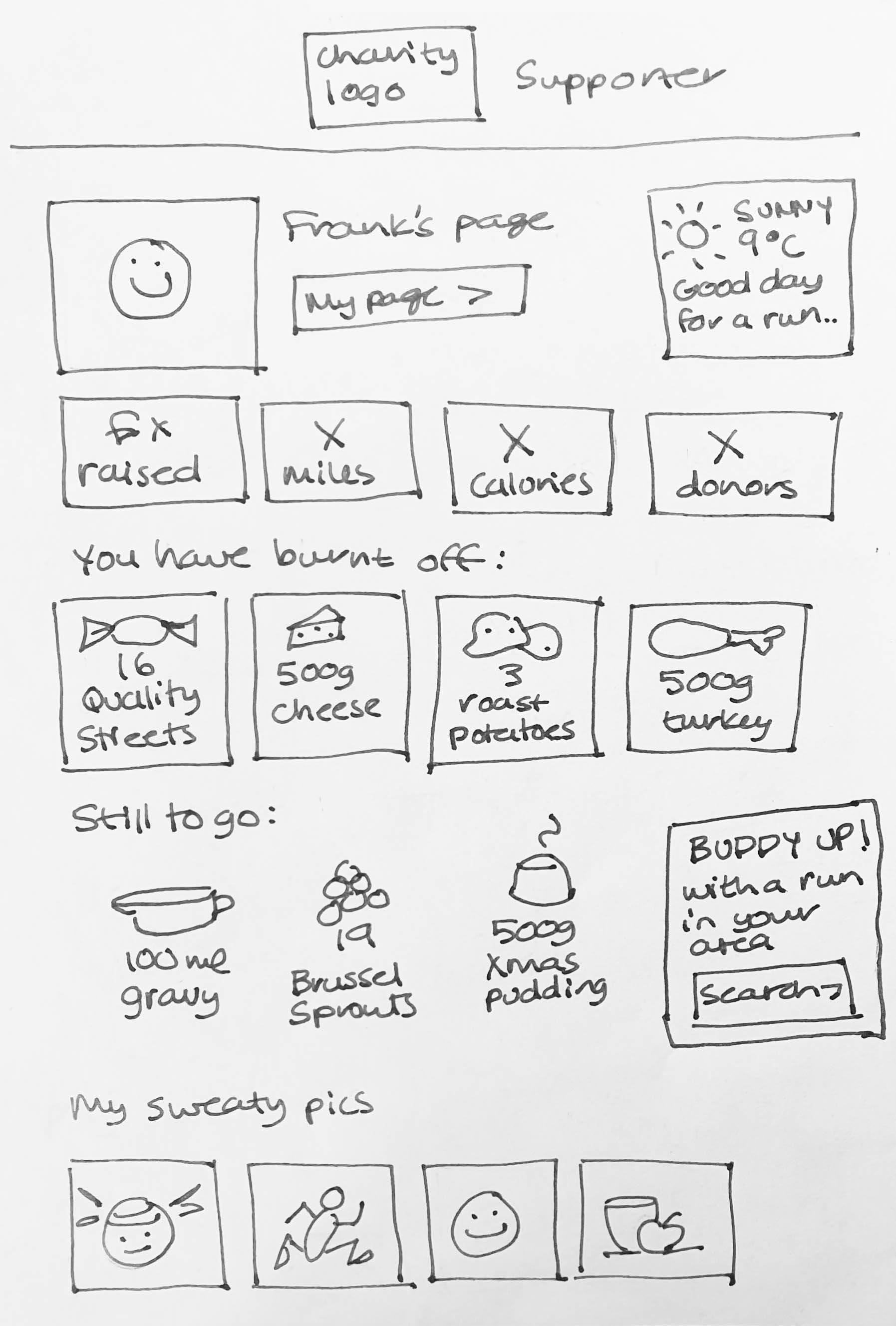
This was a concept intended to help charities raise money around New Year and promote a sense of well-being after the festive overindulgence - fundraisers exercise to raise money for the charity, and it is gameified so that fundraisers 'burn off' festive food treats by covering a distance or raising a certain amount of money. The pages include motivation to get out and about, and a sense of community by including the images and progress of all participants.
This concept was bought by a charity, and they changed it quite considerably from the sketches below. It was ultimately produced by another designer on the team.
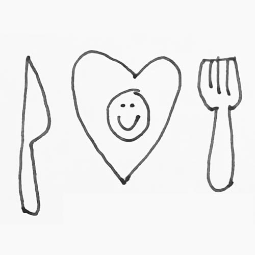
We focused on seasonal ideas to help charities to spread their activity out over the year - this is a fundraising campaign that can promote love and togetherness with food among friends, family... anyone, really. It could work with hunger-related charities, and Muslim charities over Ramadan, with the idea being that a registered group can 'buy' a place at a dinner party, and encourage others to donate to the charity. The group's page shows their team's participants, what they're eating, who their donors are and photos from their event via a social feed. This concept has not been used.